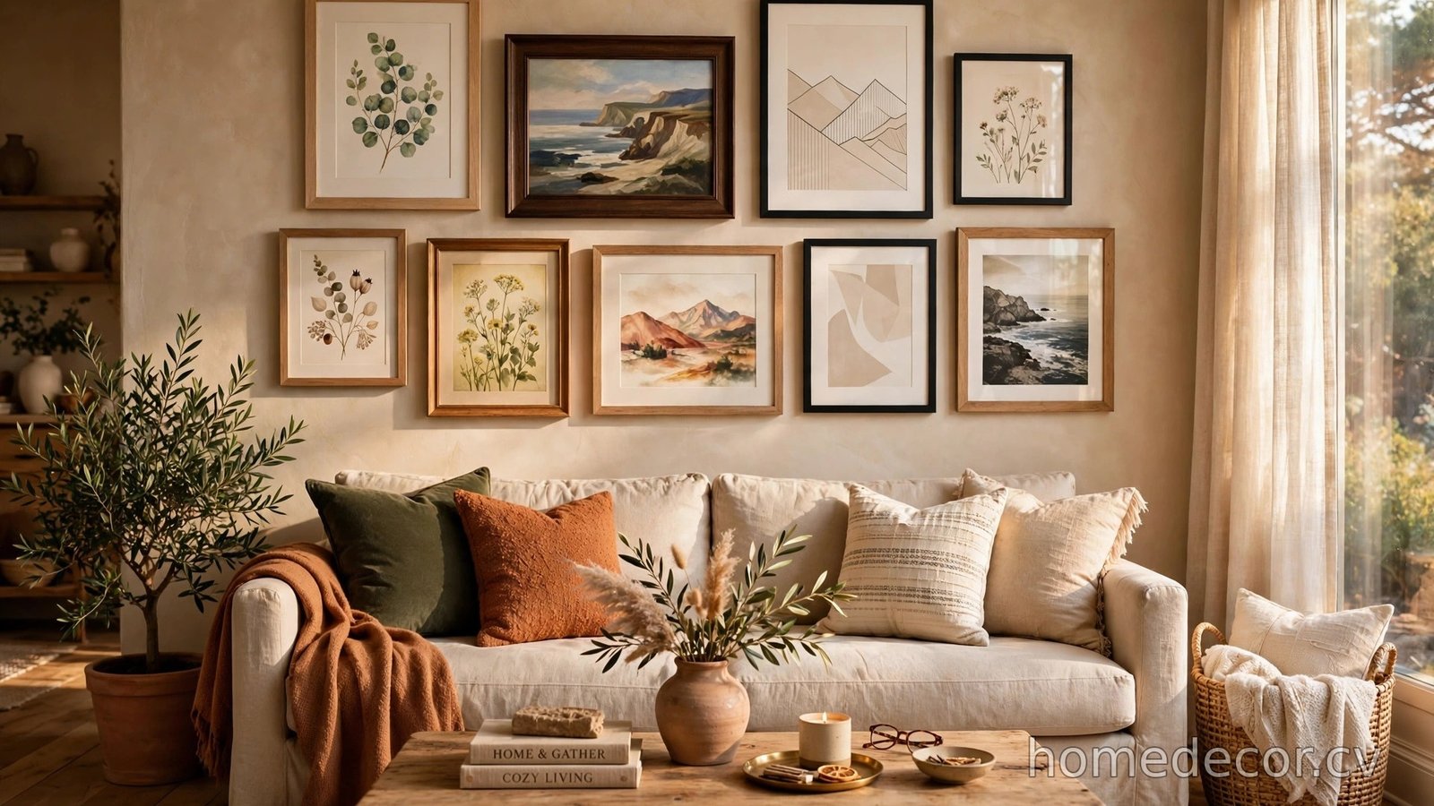
Hanging a gallery wall feels intimidating until you have a template to follow. These twelve layouts take the guesswork out of arranging art — just pick the one that fits your wall, copy the spacing, and hang with confidence.
The Classic Grid

The classic grid is the simplest gallery wall template you will ever hang, and that simplicity is exactly why it never goes out of style. Every frame is the same size — usually eight by ten or eleven by fourteen inches — and they sit in perfectly straight rows and columns with two inches of space between each one. The uniformity creates a calm, orderly feeling that suits hallways, home offices, and dining rooms beautifully. Because all the frames match, your eye travels to the artwork and photographs inside rather than getting distracted by the arrangement itself. This layout also forgives beginner mistakes, since even spacing hides slight crookedness far better than an organic cluster ever could. Before you hammer anything, lay the frames on the floor and use painter’s tape to outline the grid on your wall.
I spend far too much time saving home ideas.
If you'd like the best ones, I'll send a short email once or twice a month.
To get the classic grid right, choose one frame finish — black, white, or natural wood — and stick with it for every single piece. Mixing finishes breaks the clean rhythm that makes this template so satisfying to look at. Keep your mats consistent too; white mats with black frames are the timeless combination that galleries themselves use. When you plan the size, remember that a grid of six or nine frames usually fills a standard wall section without overwhelming it. Measure your wall first, then decide whether a three-by-three or a two-by-four arrangement fits best. Hang the center frame at eye level — about fifty-seven inches from the floor to its middle — and build outward from there. Step back often as you work, because what looks straight up close can drift when you see the whole wall.
The Salon-Style Cluster
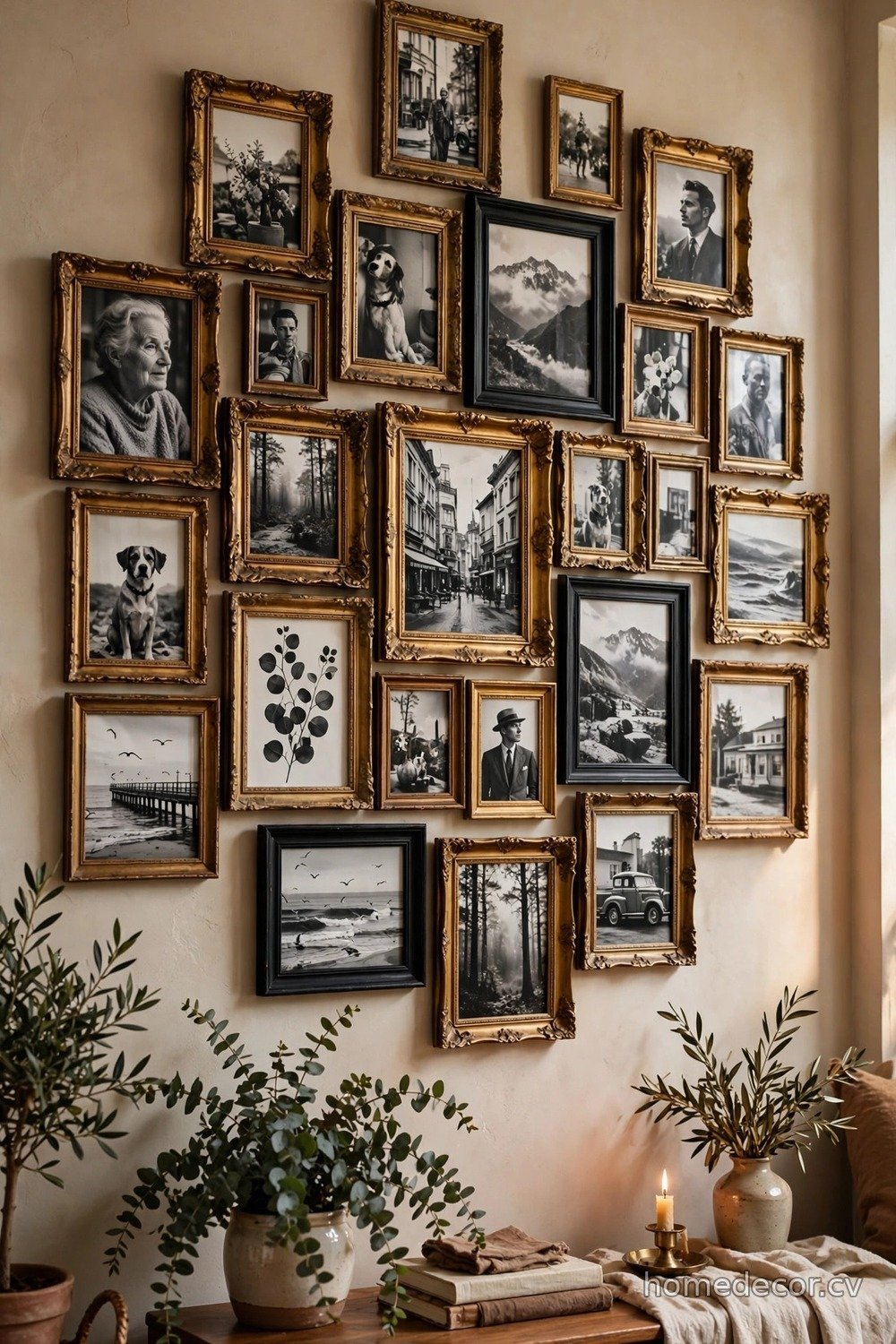
The salon-style cluster is the romantic, collected-over-time look you see in old European apartments and stylish boutique hotels. Frames of different sizes, shapes, and finishes crowd together in an organic arrangement that feels personal and full of stories. Start with your largest piece slightly off-center, then build outward by filling gaps with smaller frames, keeping roughly two to three inches between each one. The beauty of this template is that nothing has to match — a gold vintage frame can sit happily beside a sleek black modern one. What holds it all together is a consistent color story in the artwork itself, like all black-and-white photography or a warm palette of landscapes. Trace each frame onto kraft paper, tape the cutouts to the wall, and rearrange until the composition feels balanced.
This template shines when you want a wall that grows with you over the years. Leave a few intentional gaps when you first hang it, and you will have room to add travel souvenirs, new family photos, or flea market finds without starting over. The trick to keeping a salon wall from looking messy is maintaining one unifying element — maybe every frame is wooden, or every mat is cream-colored. Vary the sizes dramatically for the best effect: pair one oversized anchor piece with a handful of tiny four-by-six frames. Stand across the room to judge the overall shape, aiming for a pleasing blob rather than a rigid rectangle. If one corner feels heavy, move a small frame there to lighten it visually.
The Horizontal Row
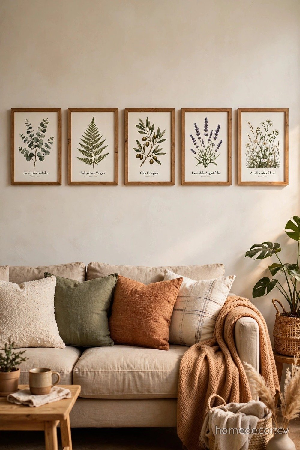
A single horizontal row of frames is the easiest gallery wall template for long, narrow walls that defeat every other layout. Think above a sofa, along a hallway, or over a sideboard where a tall arrangement would feel cramped. Line up three to five frames of the same height — the widths can vary — and center them as one long band across the wall. Keeping the tops and bottoms aligned creates a strong horizontal line that actually makes the wall feel wider than it really is. This template works beautifully with a series of related prints, like botanical illustrations, travel photos from one trip, or children’s artwork in matching frames. Use a level and a long strip of painter’s tape to mark your line before hanging anything.
The horizontal row looks most polished when you treat the whole band as one unit with generous breathing room around it. Leave at least twelve inches between the top of your sofa or console and the bottom of the frames so the furniture and art read as separate layers. If your frames have different widths, balance them by placing the widest piece in the center and stepping down symmetrically on each side. For hallways, keep the row at a consistent fifty-seven inches to center so people naturally look straight ahead as they walk. This is also a renter-friendly favorite because it needs only a handful of nails. When in doubt, odd numbers of frames — three or five — look more dynamic than even ones.
The Staircase Cascade
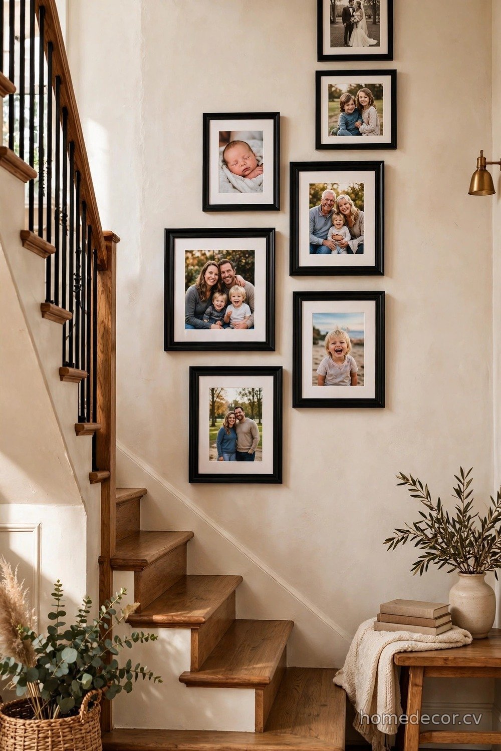
Staircase walls are notoriously tricky to decorate, but the cascade template turns that awkward angled space into a showpiece. The idea is simple: hang frames so they step upward in rhythm with the stairs, keeping each frame’s center roughly fifty-seven inches above the step directly below it. Start at the bottom of the staircase with your first frame and work upward, staggering sizes for a lively feel or keeping them uniform for a calmer look. Because you view staircase art from multiple angles and distances, choose bold, high-contrast pieces that read clearly from far away. Family photos in black frames with white mats are a classic choice that never looks dated. Map the layout with paper templates first, since patching holes in a stairwell wall is nobody’s idea of fun.
Safety and spacing matter more here than on a flat wall, so keep frames at least a hand’s width away from the handrail’s swing zone. Vary the frame sizes as you climb — a large landscape at the bottom, medium portraits in the middle, and small squares near the top creates a pleasing rhythm. If your staircase has a landing, treat it as a natural pause and center one standout piece there. Gallery walls along stairs pair beautifully with a styled entryway below, so consider coordinating with your [small entryway table decor](https://homedecor.cv/small-entryway-table-decor-ideas/) for a cohesive first impression. Step back to the bottom of the stairs frequently to check that the cascade flows smoothly without any jarring jumps.
The Centered Anchor
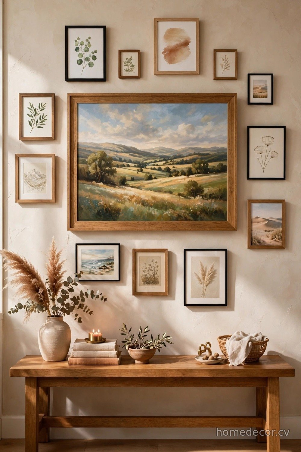
The centered anchor template starts with one large statement piece and arranges smaller frames around it like planets orbiting a sun. Choose an anchor that is at least twice the size of your supporting frames — a big landscape painting, an oversized family portrait, or a bold abstract print all work wonderfully. Hang the anchor first at eye level, then place smaller frames around it with even two-inch gaps, radiating outward in a roughly symmetrical pattern. This layout gives you the drama of a large artwork with the personality of a collection, and it suits living rooms and bedrooms where you want one clear focal point. The anchor does the heavy visual lifting, so the smaller pieces can be simple and inexpensive without the wall feeling cheap. Sketch the arrangement on paper first to make sure your orbit stays balanced on all sides.
What makes this template foolproof is that the anchor forgives almost any arrangement of the smaller frames around it. As long as the big piece is centered and level, the supporting frames can be slightly irregular without anyone noticing. Try mixing orientations — a horizontal anchor with vertical side pieces creates lovely contrast. Keep the color palette of the smaller frames tied to colors inside the anchor artwork so the whole wall feels intentional. If your anchor is very colorful, choose black-and-white photos for the satellites to avoid visual competition. This template also adapts well above furniture: center the anchor over your sofa or console, then let the smaller frames float outward. For console styling inspiration, browse these [hallway table decor ideas](https://homedecor.cv/hallway-table-decor-ideas/) to complete the vignette.
The Eclectic Mix

The eclectic mix template throws out the rulebook and celebrates the beautiful chaos of frames that were never meant to match. Vintage brass sits next to painted wood, round frames interrupt a sea of rectangles, and a tiny treasure can hold its own beside a poster-sized print. The secret to making this look deliberate instead of accidental is committing fully — half-hearted mixing reads as a mistake, while confident mixing reads as style. Unify the collection through the artwork rather than the frames: a wall of all travel photography or all botanical prints will cohere no matter how wild the frames get. Start with your five favorite pieces, arrange them on the floor, then add supporting frames until the gaps feel comfortably full. Photograph the floor layout before you start hanging so you have a reference.
Because this template is so free-form, the hanging process itself becomes part of the fun. There is no grid to measure and no symmetry to maintain, which makes it ideal for creative types who hate rigid rules. That said, you still need a sense of overall shape — aim for the collection to roughly fill an invisible rectangle or oval on the wall. Overlap is fine in small doses, but keep most frames separated by at least an inch so each piece gets its moment. Include at least one three-dimensional object, like a small wall basket or a mounted antler print, to break up the flatness. The eclectic mix is perfect for renters too, since you can build it slowly with thrifted frames and rearrange whenever the mood strikes.
The Symmetrical Pair
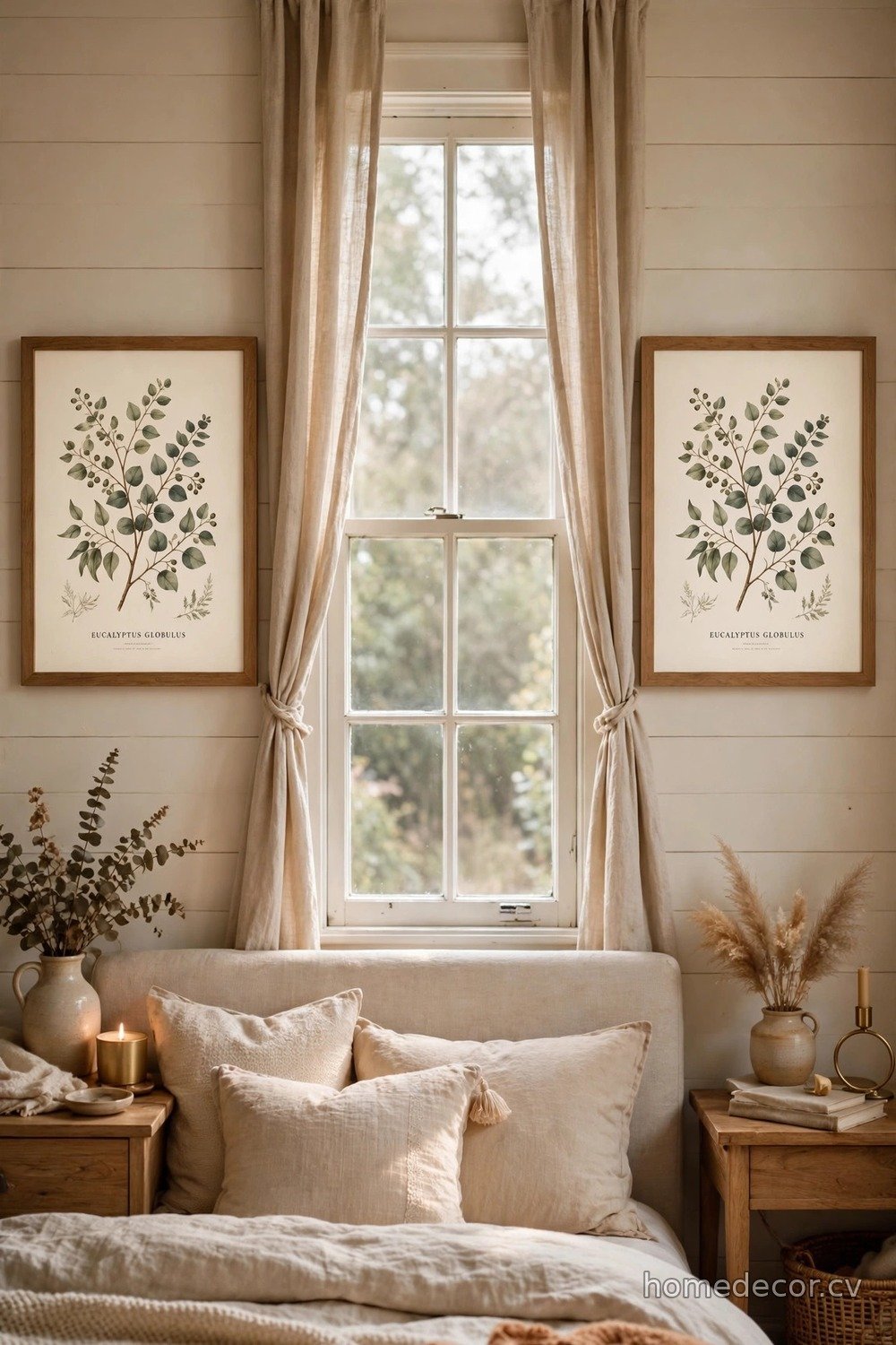
Sometimes the most foolproof gallery wall template is also the smallest: two matching frames hung side by side or stacked vertically. The symmetrical pair works magic in tight spots where a bigger arrangement would overwhelm — flanking a window, filling a narrow wall between doors, or dressing up a small powder room. Choose identical frames and mats, then pick artwork that relates without being identical, like two landscapes from the same trip or a pair of botanical prints in different colorways. Hang them with two to three inches between them, centered at eye level. The mirror-image balance feels instantly calming and requires almost no planning, which is why interior designers reach for it in tricky corners. It is also the fastest template here — you can go from blank wall to finished in under twenty minutes.
Do not underestimate how much polish a simple pair adds to a room that feels unfinished. In a bedroom, two matching prints above the nightstands create symmetry that makes the whole space feel designed. In a dining room, a vertical stack of two frames fills tall narrow walls that defeat wider arrangements. The key is absolute consistency: same frame, same mat width, same size, hung at exactly the same height. If you want a touch more interest, choose art with a shared color accent that echoes your room’s palette. This template also works beautifully as a repeating motif — hang identical pairs in two or three spots around an open-plan space for a designer trick that ties everything together. When your walls are small, restraint beats abundance every single time.
The Corner Wrap
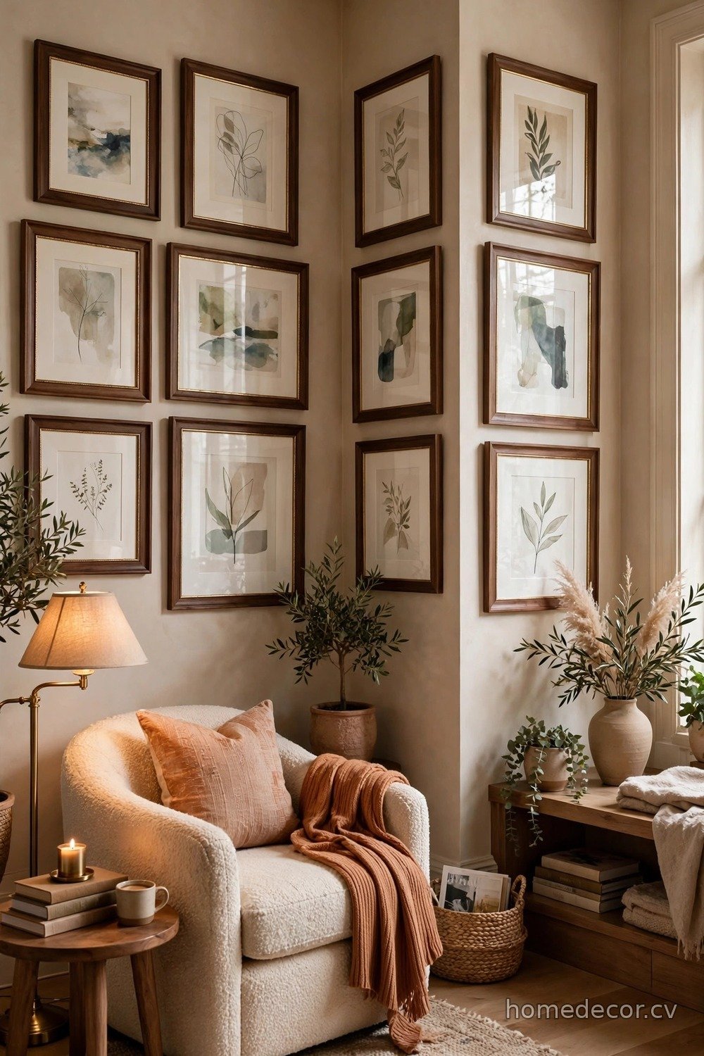
The corner wrap template treats two adjoining walls as one continuous canvas, and the result feels custom and high-end. Instead of stopping your gallery at the corner, you let frames flow around it, with pieces on both walls relating to each other across the angle. Start by hanging your main arrangement on the larger wall, then extend two or three smaller frames onto the adjacent wall, keeping the same spacing and a consistent height band. The eye naturally follows the art around the corner, which makes small rooms feel larger and more thoughtfully designed. This works especially well in reading nooks, home offices, and bedrooms where a plain corner would otherwise sit empty. Choose a unifying thread — matching frames or a consistent art style — so the wrap reads as one composition rather than two separate walls.
Planning a corner wrap takes a little extra care, so use paper templates on both walls before committing to nails. Keep the frames closest to the corner smaller and simpler; large pieces right at the angle can feel crowded and compete for attention. Maintain your two-inch spacing rhythm across the corner itself, imagining the wall as unfolded flat. Lighting matters here too — a corner that sits in shadow will swallow your art, so consider a picture light or a nearby floor lamp. The corner wrap is a wonderful way to display a collection that has outgrown a single wall, like travel photos from many trips. It turns dead space into the most interesting spot in the room, and guests always notice it.
The Oversized Statement
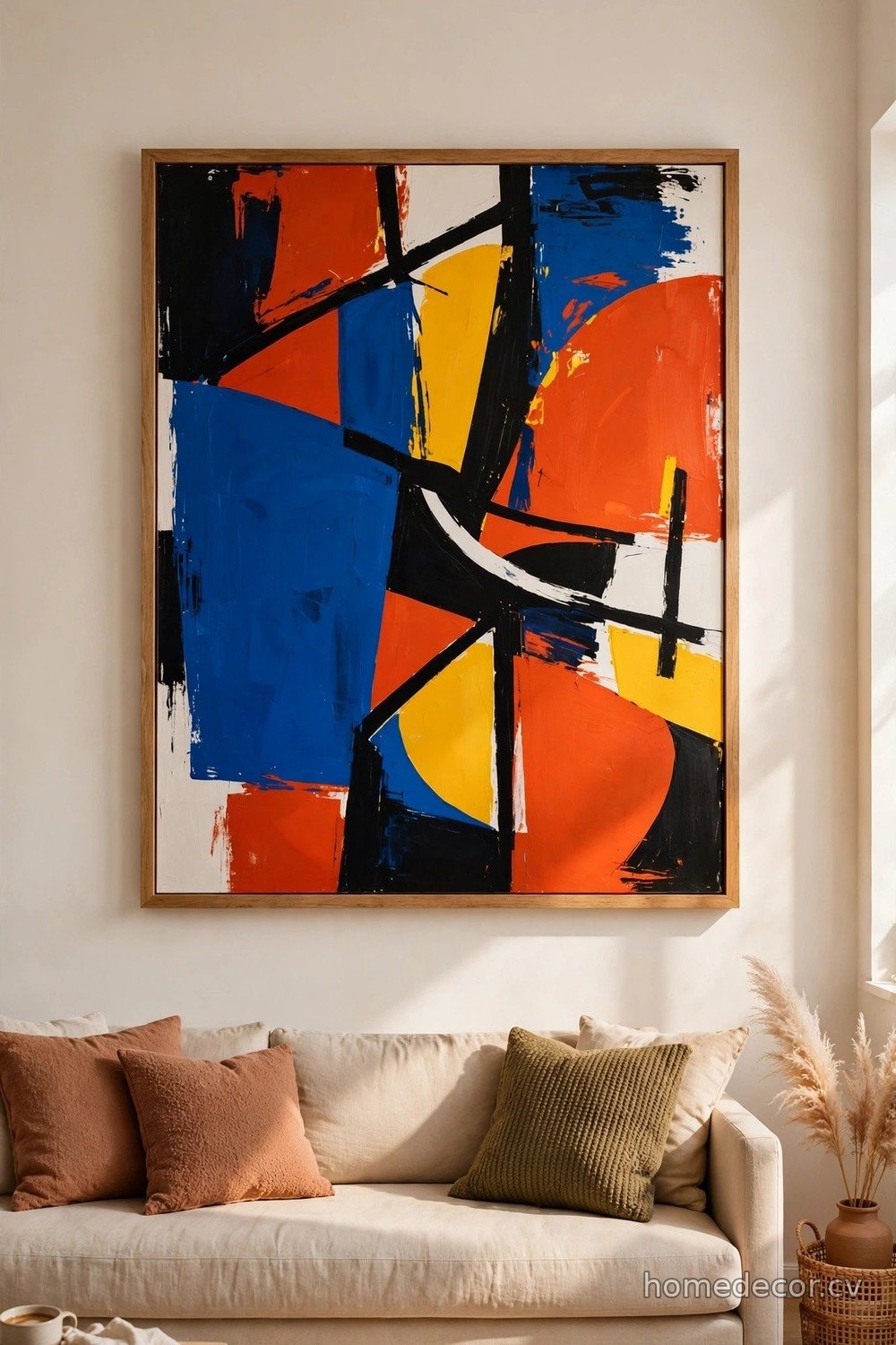
The oversized statement template skips the multi-frame fuss entirely and lets one enormous piece command the wall. We are talking about art that covers at least two-thirds of the wall width — a single dramatic photograph, a large-scale abstract, or a triptych hung so tightly it reads as one image. This approach suits minimalists and anyone who finds arranging multiple frames stressful, because there is literally nothing to arrange. One big piece also makes small rooms feel larger by reducing visual clutter and giving the eye a single place to rest. Choose art with enough presence to hold the wall: bold color, strong contrast, or an intriguing subject that rewards a long look. Hang it so its center sits at fifty-seven inches, and give it generous empty wall space on all sides.
Scale is everything with this template, so measure twice and be brave about going bigger than feels comfortable. Most people hang art that is too small for their walls, and a timid medium frame floating on a vast empty wall looks lost. As a rule, your statement piece should span roughly two-thirds to three-quarters of the furniture below it — a sofa, console, or bed. If a single huge canvas feels too expensive, fake it with an engineering print from an office supply store mounted simply, or frame a beautiful textile like a vintage rug or embroidered cloth. Keep everything else in the room quiet so the art stays the star. One perfect piece beats ten mediocre ones, and this template proves it every time.
The Floating Ledge Layer

The floating ledge template is the commitment-phobe’s dream: narrow picture ledges let you layer framed art without putting dozens of holes in your wall. Mount two or three ledges in a vertical stack with about twelve inches between them, then simply lean your frames against the wall on each shelf. The layered look — front frames overlapping back ones — creates depth that flat-hung galleries cannot match. This template is endlessly changeable, which makes it perfect for seasonal decor, rotating kids’ artwork, or anyone who gets bored easily. Mix frame sizes freely, and tuck small objects like vases or trailing plants between frames for a styled-shelf effect. Because nothing is nailed through the art, you can swap pieces in seconds whenever inspiration strikes.
Installation is straightforward, but make sure your ledges are rated for the weight you plan to display — a row of heavy wood frames needs sturdier hardware than a few lightweight prints. Stagger the frame heights on each ledge so the silhouette stays interesting rather than forming a flat line. Place your largest frame at the back of the bottom ledge as an anchor, then build forward and upward with smaller pieces. The beauty of ledges is that imperfect spacing looks intentional, so you can skip the measuring tape entirely. This template also solves the renter’s dilemma beautifully: two ledges mean two sets of holes instead of twenty. Style the top ledge sparingly and let the bottom one carry the visual weight.
The Vertical Column
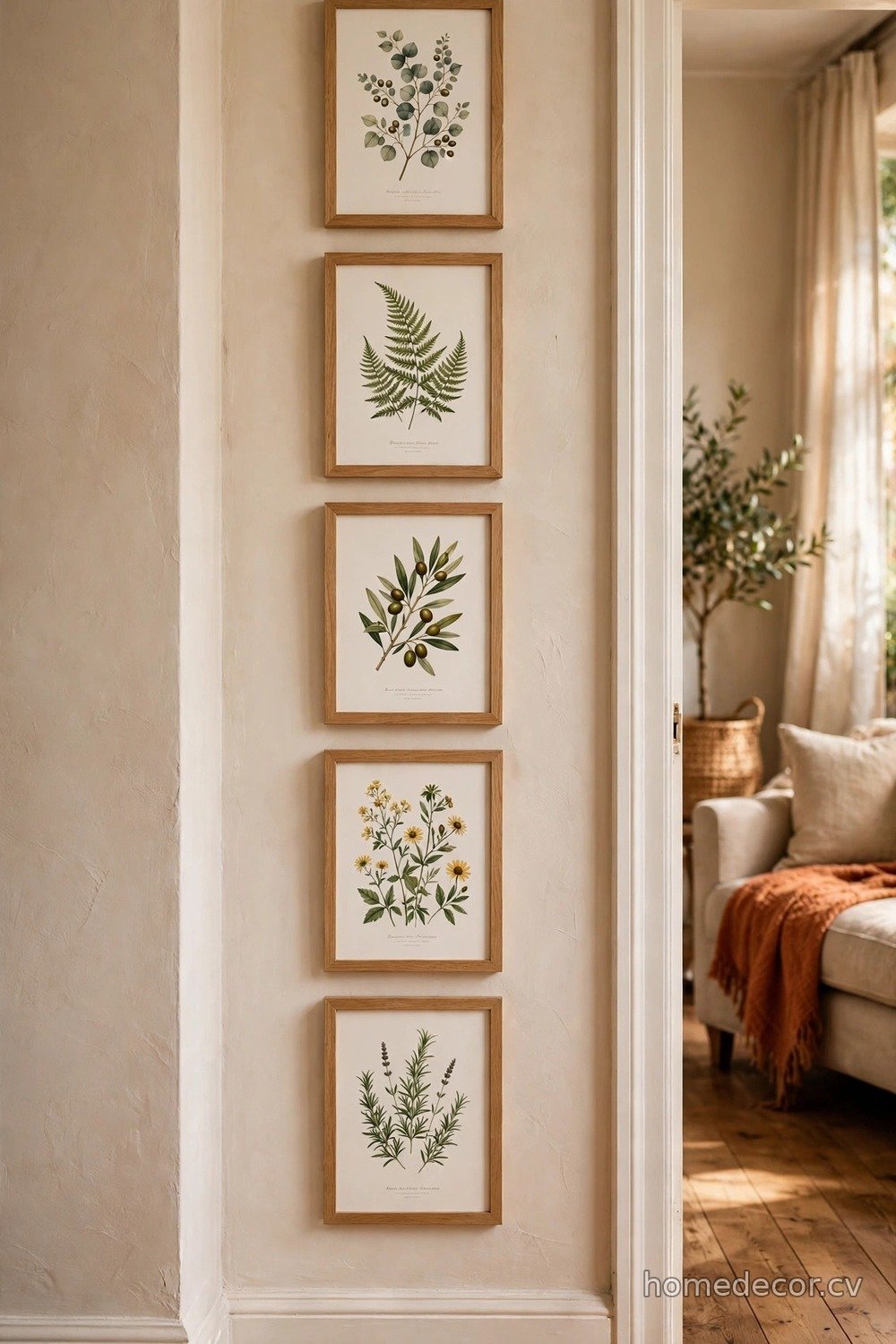
The vertical column template is made for those skinny strips of wall that appear between windows, beside doorways, and in narrow hallways. Stack three to five frames in a single straight column, keeping every frame the same width — the heights can vary slightly — with two inches of space between each one. The strong vertical line draws the eye upward and makes ceilings feel taller, which is a gift in small or low-ceilinged rooms. This template works best with a coherent series: a set of botanical prints, black-and-white portraits, or abstract pieces in a shared palette. Because the column is narrow, it never overwhelms, yet it adds exactly the finished feeling a bare strip of wall is missing. Mark a vertical plumb line with painter’s tape so your column stays perfectly straight.
Choose frames with some visual weight so the column reads clearly from across the room — thin fussy frames can disappear on a bright wall. Odd numbers work best here: three frames suit a short wall section, while five can run nearly floor to ceiling in a stairwell or entry. Keep the largest or darkest frame at the bottom to ground the composition, then lighten as you go up. If your wall strip is very narrow, consider frames with minimal matting so the artwork itself fills the space. The vertical column also pairs beautifully with tall furniture like bookcases or floor lamps placed beside it. It is a small template with an outsized impact, proving that even the most awkward wall slice deserves attention.
The Asymmetrical Balance
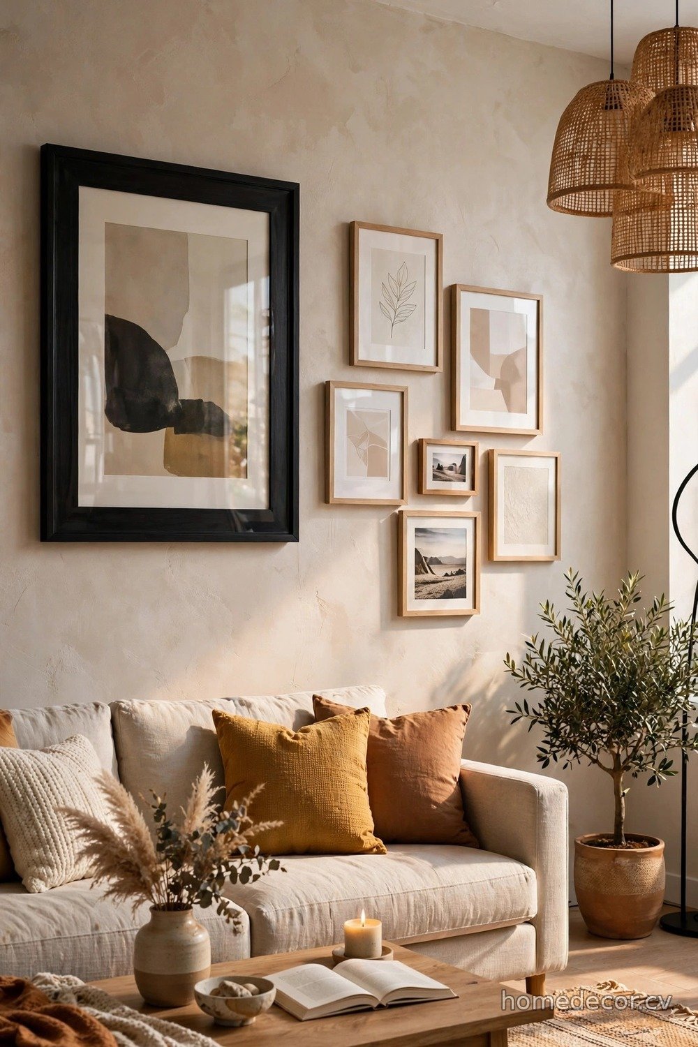
The asymmetrical balance template is for confident decorators who want a gallery wall that feels dynamic and modern. Instead of mirroring left and right, you balance visual weight across an invisible fulcrum — a large dark frame on the left might balance two smaller light frames on the right. The composition should feel like it could tip but never does, which creates an energy that symmetrical layouts lack. Start with your heaviest piece off-center, then add frames to the opposite side until the wall feels settled. Keep spacing consistent at two inches throughout, because regular gaps are what keep asymmetry looking intentional rather than random. This template suits contemporary living rooms, creative studios, and anyone whose style leans more artful than traditional. Photograph your floor layout and squint at it — if one side screams heavier, adjust.
Mastering asymmetrical balance is mostly about training your eye, so give yourself permission to rearrange. A useful trick is to think in terms of a seesaw: big and dark needs small and light on the other side to balance. Vary frame sizes boldly, since timid variation just looks like failed symmetry. Anchor the arrangement with something grounded at the bottom, like a wide horizontal frame, so the composition does not feel top-heavy. Leave a little more negative space than you think you need; breathing room is what separates a designed wall from a cluttered one. When it clicks, the asymmetrical gallery becomes the most complimented wall in your home. Trust the process, step back often, and enjoy breaking the rules beautifully.